Monday, July 25, 2011

Weekend Kallitype Printing


Untitled kallitype print, untoned
(click on image to view larger)


first prints of the series "Richard Serra's Garden"
palladium toned kallitypes
(click on image to view larger)

I recently purchased a new UV light box so that I could make cyanotypes, kallitypes and salt prints with a known constant UV source useable all year round, day and night. Up to this point, I had been relying on the sun, which of course varies in UV strength from day to day, and is useful for probably 5 months or so per year.

Getting the new light source required some recalibration of exposure times and adjustment curves for making digital negatives. I spent last weekend working on the calibration/curve problem with only limited success, and wasn't feeling very happy about things. However, as I often say in these situations, thank goodness I'm a scientist, because I've been trained to expect and handle frustration! This weekend I was working on other things, and on Sunday afternoon decided to go back to working on the kallitypes. And finally, success! I now have a workflow that I feel confident will help me turn out kallitypes with good tonal range on a consistent basis.

The second image shows three toned kallitypes that I see as the beginning of a series "Richard Serra's Garden". I've long been a fan of the American sculptor; for me, his work in sculpture, drawing and printmaking is all about mass, volume and the way they play off each other in defining spaces. I remember when I made these images I was drawn to the rocks because their juxtapositions and mass immediately made me think of Serra's work. These prints are 4"X4" on 5"X5" paper, which I think would make an ideal size for a limited edition artist book of kallitypes. I also want to use one or more of these images in a polymer photogravure workshop I'm taking in a couple of weeks. 

Sunday, July 24, 2011

Testing Boundaries

Between waking and dreaming
(click on image to view larger)

I've been thinking recently about work that lies in the space between sharply defined artistic disciplines, particularly when photography is one of those disciplines. These recently thoughts started after I received the new book Orchard Volume 2, a collaborative effort of Ray Meeks and Wes Mills entitled "Not Seen | Not Said". The book consists of photographs taken by Meeks with the addition of tipped in drawings by Mills - this sets up an interesting dialogue between the two bodies of work, with the drawings sometimes partially obscuring the photograph underneath it, and at other times keeping a respectful distance. There is an exciting energy in this book, a catalyst of ideas for exploring the interface between drawing and photography.

When I was at Lúz Gallery last night, I saw some gorgeous prints of the work of Thomas Bartlett. Bartlett explores the world through abstractions of colour and form. Printed large and hung simply with magnets on the gallery walls, it was possible to envision the works as pastel drawings with beautiful tones and a strong sense of flow.

I like this idea of blurring the lines between photograph and drawing, and I did do a few experiments last year along these lines. Today, when I walked in the forest, I played with long exposures and then tried various of processing the images as an exercise in looking at the range of possibilities for further exploration. Here's just one example from the day's work, which I find attractive because it seems to connect to master drawings of artists like van Gogh and the pictorialist photography of Alvin Langdon Coburn.

Friday, July 22, 2011

The Unexpected Moment


Unposed Office Chair, Victoria Avenue
(click on image to view larger)

I was out this evening to hear Craig Semetko give a talk about his street photography at Lúz Gallery. The images I saw were compelling in their strong combination of geometric compositional elements as a context for people engaging in the many different actions that make us human.

Semetko approaches his street photography by constantly looking for characters with stories to tell through their actions. He talked about the contributions of design, information and emotion to making a strong image. Someone in the audience asked about how his experience of the moment transforms what might otherwise be an unremarkable snapshot into an image that pulls us in, that becomes in some way magical. Semetko shared that his strongest images are made when he is alone, and feeling lonely; this combination leads him to seek out connections to others through the making of images.

Much of street photography happens in split seconds, when a variety of human elements come together (the famous "decisive moment"). Beyond a certain element of luck, a lot depends on having a well developed eye and an instinctive sense of impending action while bringing together strong compositional elements. Semetko ascribed his own ability to do this from careful and long study of the work of the masters of street photography, particularly Henri Cartier Bresson. I found this idea really resonated with me; as I've written before an artist must go beyond knowing that they "like" or "dislike" an image. It's important to think more deeply and come to an understanding of why certain images are strong and others don't work well. In discussing his images, Semetko would point out the components that made for an effective composition, adding information on how the image developed from that point, and why the image shown succeeded for him when others he took before and after that moment did not. I learned a great deal from his presentation, even though I am not myself a street photographer. 

Craig was very open and sharing during his presentation. He had many wonderful stories to tell about his journey as a photographer and it sometimes seemed that he has lead a charmed life. He spoke about how big an influence Henri Cartier Bresson's work was for him. After making images for about six years, the first gallery show Craig was offered was a two person show - 25 of Cartier Bresson's images along with 25 of Semetko's. I think we all had goose bumps thinking about that.

As I was driving home, I came upon this scene which oddly went well with the evening. I have no idea why or how an office chair came to be in the middle of the road. But it was if I was being invited to at least tentatively dip a toe in the street photography waters. I think Craig Semetko must have arranged for this!

Friday, July 1, 2011

Ambrotype Prints - Channeling Chuck Close

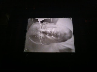
I had the opportunity yesterday to get into the darkroom to try printing the ambrotype negative I made last weekend. I have a 4X5 enlarger, but no carrier for glass negatives. I took apart a spare 4X5 negative carrier, and used cardboard to build a glass negative tray on the top half of the carrier. It was an incredible moment when I first saw the enlarged negative, with its continuous tones.

the modified glass negative carrier

in the enlarger

the projected negative
    (click on image to view larger)

I started by making a proof print on Ilford MGIV paper, at grade 2. The print had the rich tones of the tintypes I had made, but seemed a bit cool. So I made a print on Ilford warmtone paper:

fractured self (Ilford Warmtone Paper)
(click on image to view larger)

One of the things I was interested in trying with the negative was lith printing. I started with a lith print on Fomatone MG Classic paper, which was interesting but a bit too orange in tone. I think I might investigate this paper further by following up with selenium toning to see if I can tame the colour.

fractured self (lith print on Fomatone MG Classic Paper)
(click on image to view larger)

I had made a second print on the Ilford warmtone paper with double the correct exposure so that I could try a process called "second pass lith". The idea is to overexpose the print, process normally, then bleach the print partially followed by a second development with a lith developer. I chose to use copper sulphate bleach because it can cause a split-tone or pseudo-solarization with second pass lith. I like this image, it feels as if it references the experiments of Man Ray:

fractured self, rayified (second pass lith print on Ilford Warmtone)
(click on image to view larger)

Finally, I tried a straight lith print on Kentmere Fineprint warmtone paper. I've had hit and miss results with lith printing this paper, it seems very slow to develop and doesn't always give interesting results. However, this print is for me the most successful - it has the creamy tones of a cyanide-fixed tintype combined with shadow detail that has the feel of a charcoal drawing:

fractured self (lith print on Kentmere Fineprint warmtone)
(click on image to view larger)

In future, I have a couple of other paper choices to investigate with lith printing. I'm also looking forward to printing this negative as a salt print and a kallitype. I'm excited about getting everything together to make more ambrotype negatives in my studio so that I can keep pushing this process.