
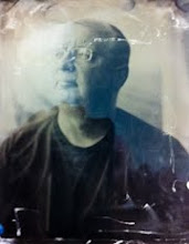
the modified glass negative carrier

in the enlarger

the projected negative
(click on image to view larger)
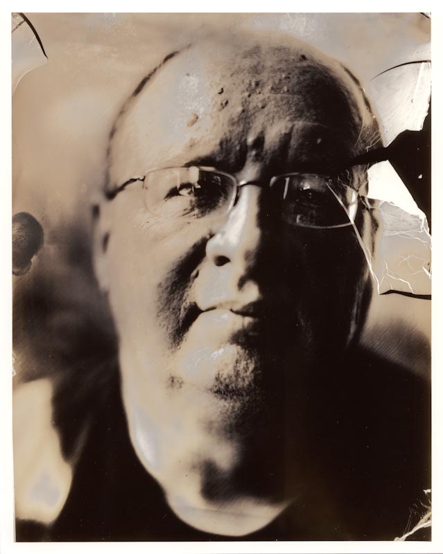
I started by making a proof print on Ilford MGIV paper, at grade 2. The print had the rich tones of the tintypes I had made, but seemed a bit cool. So I made a print on Ilford warmtone paper:

fractured self (Ilford Warmtone Paper)
(click on image to view larger)
One of the things I was interested in trying with the negative was lith printing. I started with a lith print on Fomatone MG Classic paper, which was interesting but a bit too orange in tone. I think I might investigate this paper further by following up with selenium toning to see if I can tame the colour.

fractured self (lith print on Fomatone MG Classic Paper)
(click on image to view larger)
I had made a second print on the Ilford warmtone paper with double the correct exposure so that I could try a process called "second pass lith". The idea is to overexpose the print, process normally, then bleach the print partially followed by a second development with a lith developer. I chose to use copper sulphate bleach because it can cause a split-tone or pseudo-solarization with second pass lith. I like this image, it feels as if it references the experiments of Man Ray:
fractured self, rayified (second pass lith print on Ilford Warmtone)
(click on image to view larger)
Finally, I tried a straight lith print on Kentmere Fineprint warmtone paper. I've had hit and miss results with lith printing this paper, it seems very slow to develop and doesn't always give interesting results. However, this print is for me the most successful - it has the creamy tones of a cyanide-fixed tintype combined with shadow detail that has the feel of a charcoal drawing:

fractured self (lith print on Kentmere Fineprint warmtone)
(click on image to view larger)
In future, I have a couple of other paper choices to investigate with lith printing. I'm also looking forward to printing this negative as a salt print and a kallitype. I'm excited about getting everything together to make more ambrotype negatives in my studio so that I can keep pushing this process.
3 comments:
I love that final Kentmere lith print. Stunning.
It's fascinating to see how different the same negative looks when you use different printing processes - thank you for sharing! I agree, that last print is wonderful, and I see the resemblance to a charcoal drawing even on the screen.
I look forward to seeing these in person. Really beautiful and unusual.
Post a Comment