Helen Frankenthaler
"Message from Degas"
I have long been a fan of Frankenthaler's work in etching and lithography. I picked this image because I learned a lot from it about proportions within space, the use of fine line to create contrast to large masses in a way that activates the composition, and most importantly that rules must sometimes be broken for the sake of composition. In this image, there is a large mass of darkness coming from the top of the frame. Our natural inclination (and one of the "sacrosanct" rules of composition) is to place such a large, dark mass at the bottom to "ground" the image. Sticking to the rules would not have produced such a strong, compelling work and would have decreased the sense of flow we feel in the yellow ground.
In the work on the right, Frankenthaler used the colour palette of Manet's still life, but she broke down Manet's composition to its most fundamental base - the distribution of colours and tones, thus transforming the classical still life into something far more emotional. This type of transformation is something I strive to produce in my photographic work.
Pat Steir
Starry Night: August
I've taken away several lessons from the prints and paintings of Pat Steir. If you look at this image, you can sense that it continues beyond the confines of the frame, which engages your imagination as you actively "fill out" the image. I learned that you can have an image that uses mostly dark tones with bright highlights in a way that doesn't feel high contrast but convinces you that you are looking at a normal scene with a full tonal range. The pattern in this image is random, but reads as if there is an order to it, one that can be discerned with further consideration. I also like the light pattern on dark because it makes me aware of the patterns of lichen and erosion on the coastal rocks where I live.
Richard Diebenkorn
"Cityscape"
"Ocean Park"
I've learned a lot from Diebenkorn about geometry in the landscape, how it can be used to create effective compositions (e.g. Cityscape), and not to fear having a large open space within a composition. Look at that huge expanse of blue in Ocean Park and imagine creating a photographic composition that crowds the contrasting elements into a small part of the overall image. When you look further, you realize this isn't minimalist to the point that we have basically a horizon line that fails to meet the "rule of thirds", but otherwise divides the space into two bands of tone - this composition contains several geometric and colour elements within that thin band at the top, that counterbalance the huge expanse of blue and are bold enough to hold our attention.
Gerhard Richter
"Drawing, 1999"
Drawings like these by Richter have taught me a lot about the importance of placing elements within a composition, about the importance of how the elements relate to each other, and about how information is transmitted to the viewer by these elements. Looking at this drawing, I can easily see a marsh scene, the shore with grass on the left, reeds in the water on the right. Looking at this makes me realize that artistic intent doesn't have to be sacrificed for clarity; the viewer can extrapolate from partially visible elements in either a dark or high key image to interpret the scene portrayed. Looking at this drawing makes me think of images of blade of grass in fields of snow made by Harry Callahan.
"Hanged"
Richter is famous for his blurred, photorealistic paintings. This one is made from a newspaper photo of the body of Gudrun Ensslin, a founder of the Red Army Faction, who hanged herself in prison. For me, the blurring represents a truth about photography - that it can never convey the absolute truth. Of all the visual arts, we turn to photography as the purveyor of unvarnished fact. Yet it can never fulfill that role - the person who took the photograph has made decisions about composition and lighting that blur the facts, at least a little bit. The facts are blurred further by the viewer, who rarely looks upon an image in a completely dispassionate way, but brings interpretation and opinion to that viewing. Again, there is a slight distortion of fact. Add onto that the collected viewing by many people and the resulting polarization of opinions about the image, and then the truth is blurred further, just as Richter has shown in this painting. I find this idea freeing, because I don't have to feel that as a photographer I'm constrained to make images that are completely representative of a set of facts that are before me. I can be free to interpret what I see and make art rather than just a photographic record of facts.
Richard Serra
"Sequence"
"One Ton Prop (House of Cards)"
I've learned a lot from the sculpture of Richard Serra about how objects not only occupy space, but also define space. The lines defined by the edges of the materials that he uses have made me look for edges and lines that "draw" objects and spaces in my photographic compositions. Serra also draws and makes prints, and it's interesting to see how he visualizes the transition of his three dimensional ideas to the two dimensional medium of drawing, just a photographer must visualize representing the three dimensional world in a flat object:
"Splines"
Edoardo Chillida
"Euzkadi V"
"Gravitation"
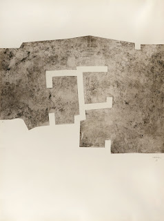
Chillida is another sculptor who also worked in drawing and printmaking. When I look at his work, I'm inspired to consider how I will produce the final work from my photographic practice. In the Euzkadi print, it is interesting to consider how he placed the image on the paper, how those decisions become part of the composition and define a larger space. In Gravitation, materials are layered, with cut outs to define space and spatial relationships as well as mark-making to distinguish different compositional elements. This work inspires me to question whether photographs must be a single layer (I'm not thinking of Photoshop here), what might be gained by combining different materials, using cutouts to reveal only parts of an image. There's also many things to take away from this work in thinking about making artist's books.


No comments:
Post a Comment