Sunday, August 5, 2012

Inspiration comes from doing

French Breakfast, © 2012 Paul J. Romaniuk

I have enjoyed collecting inspiring quotations and images from artists I find inspiring and love sharing them with others through venues like this blog and Facebook. But recently I’ve been questioning what “inspiration” is or should be, and how it fits into my artistic practice. Because the truth is, I have never felt a need to be “inspired” to go make work, but I certainly do struggle with distractions and decisions about what to work on.

My musings on the meaning or role of inspirational quotes/work has come more sharply into focus the past week during the Olympic Games. The television coverage includes up close and personal videos on the trials and tribulations of some of the individual athletes – the barriers or personal tragedies they had to overcome, or the sacrifices their families had to make to help them. I find these spots very emotional and touching, and I often think that the athlete in question is such an inspiration. Yet I have never found myself leaping up off the couch and establishing a training regimen, or bounding down the stairs to the studio to begin furiously working on projects. The same has been true for many of the quotations I’ve come across, or work that I’ve seen.

This introspection is helpful because it makes me realize that for something to be truly inspiring, it has to provoke an action, not just a reaction. Watching those Olympic features, reading those quotations can fill me with feelings of being inspired, but they are acting as placeholders for action, and really are just distractions. I get to feel something, but there are no concrete results. I’ve realized that there is a huge gulf between collecting inspiring quotations and originating them: the difference of having personally experienced something, and understanding its importance.

I now realize why there are a couple of quotes that have resonated very deeply with me for quite some time. Chuck Close said “The advice I like to give young artists, or really anybody who'll listen to me, is not to wait around for inspiration. Inspiration is for amateurs; the rest of us just show up and get to work. If you wait around for the clouds to part and a bolt of lightning to strike you in the brain, you are not going to make an awful lot of work. All the best ideas come out of the process; they come out of the work itself. Things occur to you. If you're sitting around trying to dream up a great art idea, you can sit there a long time before anything happens. But if you just get to work, something will occur to you and something else will occur to you and something else that you reject will push you in another direction. Inspiration is absolutely unnecessary and somehow deceptive. You feel like you need this great idea before you can get down to work, and I find that's almost never the case.”

Richard Serra said more succinctly “Work comes out of work”. I don’t know if Georgia O’Keeffe ever said anything on this subject, but she was known for going to the studio faithfully every day, even if she just stretched canvas or swept up. I think the key thing these artists recognized was the need to establish a habitual routine of working, which in turn strengthens the neural pathways that compel them to go to the studio and make work. And the benefits of that routine in jumpstarting productive phases in their practices.

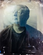
For the past two months I’ve been working on a couple of projects on a daily basis: continuing a series of lumen prints and exploring the potential of wet plate photography. I found that each time I made something, I got excited, and was inspired to make more. Even when the results were disappointing, as they were recently when I attempted some photogravure prints, taking the time to sit with the disappointment brought inspiration because I found myself getting excited about making line etchings again. I know that I will sort out the problems with the photogravures, but by making those attempts now I also got inspired about pairing up gravures with line etchings. Reflecting on these experiences has made me realize why those quotations of Close and Serra resonated with me – I knew from my experience that true, pure inspiration is sourced internally, and comes from doing.

Wednesday, April 25, 2012

Turning Towards Self-Publishing with Lauren Henkin


In my last post on why I’m skipping the “Photo 2.0” upgrade, I outlined the signs I’ve seen that artists are leaving the on-line, digital realm of presenting work and returning to, or newly embracing, physical objects as the output of their artistic practice. None of this is surprising because people who buy and collect art are looking for physical objects, be it original works, fine prints, sculptures, or hand crafted books. They appreciate the choices artists make about the process that was used, which paper was used, what materials with different textures and smells were used, the size and shape of the print/book/painting. These same choices and opportunities create work that can be experienced on a richer, deeper level that is more compelling to both artist and audience.

Leading these changes are artists who are not only producing fine art objects, but are selflessly helping others who want to extend their artistic practice in that direction. One such person is Lauren Henkin, a remarkable artist from Portland who in recent years has produced a series of extraordinary hand crafted fine art books of several compelling bodies of work. Lauren has a full time day job, and takes on art projects that might last a year from initial concept to completion and require many late nights in the studio. Yet she also chooses to spend a great deal of time and effort encouraging other artists who want to improve their work and produce finely crafted work, by maintaining a pretty busy teaching schedule. Her drive and generosity of spirit is truly remarkable.

This weekend I was one of seven students in a two day workshop Lauren gave at Lúz Gallery in Victoria entitled “Turning Towards Self-Publishing”. Having taken a workshop on marketing previously with Lauren, I knew that I could expect a well organized, comprehensive presentation given with clarity, kindness, wit and with a sensitivity to the different needs of individual students. And that was exactly the experience I had in this new workshop.

I think one of Lauren’s great gifts, and what makes her an outstanding teacher, is her generosity in sharing her personal experiences and stories as they relate to the subject at hand. In this case, she shared the pitfalls and mistakes she went through with her first book project; she share financial details, and time commitment requirements of her projects so that we could fully understand the scope of each of the different book projects she’s completed. There are not many teachers who would be so open about their experiences.

The topics covered in the first day and a half were comprehensive, including details on how to finance a project, how to find and work with collaborators (e.g. designers, bookbinders, letterpress artists), how to learn the difference between different types of handcrafted books (important for conversing with various dealers and librarians), how to structure a project from beginning to end, when and how to build an audience for your book, how to market the book, how to increase your chances of recovering the costs of the project and gaining income beyond that.  We also looked at many examples of different fine press and artists’ books in our hands – Lauren shipped four boxes from her personal library to share with us. We were introduced to the wide variety of paper choices for bookmaking, and cloth/paper choices for binding from sample books that she brought. There was also a presentation on elements of designing a book, and inspiring examples of the many different forms artists’ books take.

You’re probably reading this, thinking that no matter how well organized the workshop was, that sounds like an overwhelming amount of information, and how could anyone possibly retain enough of it. In addition to the excellent instruction, Lauren had prepared a 65 page course manual that can be used by each of us as a resource after the workshop. In the words of one student “this manual alone is worth more than the cost of this workshop”.

The final afternoon was spent looking at prints each student brought of bodies of work they were considering for a book project. Lauren engaged the entire class in considering each other’s work, how it related to the intent of the project, what were the strongest images that relayed that message, and how could those images be effectively sequenced. This was done in a very supportive, sensitive way and was in itself a great learning experience.

I took away three important lessons from this workshop, each of which I think illustrates what a great teacher Lauren is, and how well she connects to her students. The first important lesson was her caution that making books takes time away from photographing/drawing/painting – i.e. making content. She encouraged us to think carefully about that and whether delving into book making was consistent with the goals of our art practice. The second important lesson was her encouragement that everyone take on a project that would have be consistent with the time we were prepared to devote to it, even if it was a small project that didn’t involved producing a bound book. While she had given us the information and tools to tackle complex projects, it was clear that she supports and encourages artists who are willing to take on a book project regardless of whether it’s relatively simple or complex. The third important lesson was her relentless requirement that whatever we choose to do, that we do it to the highest level of craft possible, out of respect to the quality and beauty of the images we are each producing.

It’s that final lesson that has defined every outstanding teacher I’ve ever had, and Lauren is firmly in that group.

Sunday, March 4, 2012

I'm Skipping the "Photo 2.0" Upgrade

THE BRAVE NEW WORLD OF PHOTO 2.0

When software companies offer an upgrade to a program, users inevitably have to weigh a number of factors in deciding whether to buy the upgrade. Among those factors are desired new features, whether their needs are served by the upgrade, cost, and ease of use. The software companies use various tactics to persuade us to upgrade: it's faster, it's got many new features, old versions are no longer supported, you're in danger of falling seriously behind if you don't upgrade. These tactics typically play on our vanity/anxieties and create this atmosphere of fear of being left behind. And they generally work well, unless the upgrade is deemed to be so bloated and so much time has passed before its release that it is already out of date.

I had never heard of the "Photo 2.0 Upgrade" until I rejoined Facebook back in the summer. I had been completely unsatisfied with my experience with Facebook before, and had gone to the extreme of having my account absolutely deleted a few years ago. But during the summer I met a number of people while taking workshops that I wanted to keep in touch with, and Facebook was the best way to do that. And in general using Facebook to keep in touch with fellow artists and new friends I've met in person has been great.

What does this have to do with "Photo 2.0"? Well, during the course of my explorations on Facebook, I joined several photography-related groups. Through these I encountered a small "band of brothers" who have been advocating the new dawn of photography based on the perception that the hindrances to artists getting their work distributed and recognized through the "old" gallery system were being completely swept away by access to the internet. Yet with this democratization had come a problem, according to the advocates - now that everyone had started promoting their work this way, it was making it difficult to find the truly excellent work amongst all the average work that was flooding onto the net. And so this band of brothers set themselves up to be the arbiters of outstanding art on our behalf  by assuring us that rather than wade through the murky waters ourselves, they will decide who is producing the best images, the best photo books, etc. In other words, they have set themselves up as the new gatekeepers/tastemakers while disparaging the gatekeeper system of yore. Physical gallery shows are viewed as being tolerable by the new advocates, but inferior to on-line presentations. Physical photo books - tolerable but only until whiz-bang interactive ebooks are out - we're assured that's what everyone will demand.

WHY I'M SKIPPING THE PHOTO 2.0 UPGRADE

In a nutshell, I'm skipping this upgrade because I know that Photo 3.0 (see below) is already taking shape. The Photo 2.0 upgrade is outdated, redundant, bloated beyond belief and has few features useful to photographers. The leading advocate of Photo 2.0 has been getting free dinners and invitations to speak at conferences and meetings about his brave new world of photography for five years. Going back to the software analogy (it's really their analogy, not mine), the successful software companies push out major upgrades of their products on a roughly 12-18 month schedule. Two years is pushing it, beyond that the software is basically considered dead or abandoned. I think it is safe to say that Photo 2.0 is dead.

And it should be dead because it is redundant, bloated and almost useless to photographers looking to effectively promoter their work. Photo 2.0 is redundant because it relies on gatekeepers/tastemakers, a shockingly small group of them who seem to spend more time self-referencing and cross-referencing each other on their web sites, Facebook, Twitter etc. than they do actually promoting the best photographic work. Their target audience is primarily photographers (those are the people who are going to validate their efforts by providing content for their web site) so they are doing nothing to get the best work in front of collectors, or to expand the market for photography by bringing in new people who have never collected photography. You are far better off working with a local gallerist, who will definitely bring your work to the attention of collectors, who works to introduce new people to collecting art, thus expanding your market, and who in this day and age has a web site which puts your work in front of the global market.

I consider Photo 2.0 bloated because even through the filter of this band of brothers, far too much work is getting exposure, and done with an implied stamp of approval. While looking at the work of others is part of a vibrant art practice, it is only instructive if it's done in a very limited and thoughtful way. Most of the Photo 2.0 related sites put up "featured" images on their home page for 1 day, then replace then all the next day. They also often have large "collections" of images by featured artists which quickly end up in the "archives" which is probably visited very infrequently. And they promote themselves by playing to the anxiety/fear factor by implying that if you aren't willing to provide content to them on their terms, or aren't constantly checking their sites for important work by others, you are going to be missing out on high impact exposure and knowledge. It's all a load of bs, and it encourages behaviour that is detrimental to an artist's development. Furthermore, anyone whose work is featured on a site this way is getting little to no benefit because it's presented in the most superficial manner for the briefest of time.

 PHOTO 3.0: THE FUTURE IS HERE
 
So if Photo 2.0 is stillborn, where are we at? For those who have kept an open mind, open eyes and been observant, the future of photography has already arrived. Smart photographers are using social media to keep in touch with each other, and to make occasional, considered announcements about new work. Some also document projects in progress to give a bit of a "behind the scenes" look which allows prospective collectors to form a more personal connection to the artist and the work in progress. Many have a web site for formal presentation of recent work, and others keep a blog to talk about the motivations behind their work which helps build relationships with potential collectors. And most are either remaining committed to producing physical objects in the form of prints and books or are returning to those modes of production in combination with digital approaches after a foray into the completely digital realm. Rather than rigidly adopting a completely on-line or completely analogue approach to making, marketing and selling work, they are finding the right blend of tools that is most effective for them.

The signs are everywhere. I was at a talk in the fall given by Dan Milnor about book publishing. There was some discussion of ebooks, and a high school teacher in the audience shared that he had asked his students whether they preferred physical photo books or ebooks and was surprised (pleasantly) that they all said that they far preferred physical books. Another contributed that students are bored with the digital methods they grew up with and are so familiar to them and are excited about learning analogue methods for producing work. While people continue to declare film is dead (or is not dead) and analogue methods of making photographic images are fading away, there's ample evidence of photographers reinstating darkrooms, learning other fine art methods of producing photographs such as wet plate collodion, cyanotype/kallitype/platinum printing, photopolymer gravure printing. And none of this is surprising because people who buy and collect art are looking for physical objects. They appreciate the choices that go into the process that was used, which paper is used, what materials with different textures and smells are used, the size and shape of books, the type of printing. People are turning their backs on sites like Flickr and Facebook where they find the discussions about photography to be superficial, and are meeting in person with others to engage in a more thoughtful discussion. In two instances last year, workshop groups that I was a part of have gone on to have informal critique sessions; one group has organized a group show at a local gallery.

The key here is the decision by more and more artists/photographers to maintain control of their art practice and the eventual outcome of that practice. They use the on-line and analogue methods in ways that fit their needs, not someone else's. They are respectful of their potential collectors, and of other artists by not flooding sites with constant promotional materials, or constantly showing the same images from a body of work (both of these activities lead to visual exhaustion and are counterproductive). They build relationships with other artists and gallerists in their local communities to work together to build a better appreciation for art in general and to expand the size of the local market for art. Some are selflessly bringing the work of other artists to the attention of many people through on-line blogs. These people represent the tribe that I want to belong to.


Monday, December 5, 2011

Visual Narratives - a workshop with Susan Burnstine

"A great photograph is a search for meaning. It asks questions that lead to a lot of other questions."

And so started a weekend adventure in identifying personal inspirations and motivations for the twelve photographers in Susan Burnstine's workshop Visual Narratives given this weekend at Lúz Gallery. In many ways, that lead statement was prophetic for the work we did in this class, because to make great photographs really requires that an artist understands what meaning they are searching for and that they are most strongly connected to. And finding out what that is for each individual involves asking questions that in turn lead to many more questions. It involves looking at each person's work and asking questions that dig deeper and deeper for meaningful answers.

If that sounds intimidating and raw, the kind of deep introspection that you've avoided because it makes you uncomfortable and wiggly, you're getting the right idea. It's the magic of Susan and the workshop that she's developed that you will, with her guidance and the help of your fellow workshop students, drill down and find true understanding of what you are strongly drawn to, what meaning that has for you, and how that informs the work you've done and can even more strongly inform the work that will come.

I think it's fair to say that for all of us the realization at the beginning of the workshop that this was what was in store for us was at least somewhat frightening (or a whole lot of frightening). Through careful structuring of the progression of activities in the workshop, and by being very open, genuine, caring and quietly relentless, Susan helped guide us through this daunting task. Sure there was some resistance, sure there were a few tears, but there was also a lot of laughter and good will shared by all of us, and that sense of going through something together that made for an incredible experience from which each of us will grow as artists.

I find myself reluctant to talk about the process we went through during the workshop, not because it was so traumatic (it wasn't). Although we all did the same exercises, there was enough attention given to the specific needs of each individual during those exercises that each of our experiences was unique. This was not a cookie-cutter, "one size fits all" workshop - each participant was given the time, energy and level of inquiry that was appropriate for where they are in their development as an artist. Each person had the support and help of all the other participants during each stage of the workshop. It was an incredible group of people from diverse backgrounds who contributed an astonishing array of information and insight as we talked about the current work each person showed.

In my own case, I feel that I left the workshop with a greater understanding of what is driving my photography, what deep meaning I'm connecting to and searching for in my images. I learned a great deal about how key inspirations are the foundation upon which I have, and can continue to build my own visual language. With Susan's help, I identified some key words that succinctly connect me to that deeper meaning of my work, that I can use as cues when going on to make more images. There were also suggestions from Susan of other artists that will act as further inspirations more closely related to the deeper meaning that informs my work. We were also introduced to the work of some of the most important storytellers amongst current contemporary photographers that will serve as a reference from which we can draw wisdom and inspiration for some time to come.

I have to admit that I don't feel what I've written comes close to doing justice to how great this workshop was. I've found it difficult to put into words what this experience has meant for me. I can say that as a teacher myself, I was in awe of Susan's unwavering commitment to each of the students, her generosity in sharing her experiences and knowledge, her discerning eye and ear and the empathy she had for each person during the process. If you have the chance to take a workshop with Susan, don't hesitate for a second. It will definitely change your life as an artist in the best possible way.

Another important factor in the success of the weekend was the wonderful environment created by the fine people at Lúz Gallery. Quinton, Melissa and Tom made sure the workshop ran smoothly and were wonderful company during the  weekend. I've been quite fortunate this year to take four outstanding workshops at Lúz - wet plate with Joni Sternbach, photopolymer gravure with Don Messec, marketing with Lauren Henkin and now visual narrative with Susan Burnstine. Each workshop lead by not just a knowledgeable expert, but also an outstanding teacher who offered an outstanding experience. Thank you Quinton and Diana for your vision in bringing such consistently high quality workshops to my little town, and thank you to Melissa and Tom for helping to create that welcoming environment.

Wednesday, November 30, 2011

Influences and Inspiration

I'm going to be taking a workshop at Lúz Gallery this weekend entitled "Visual Narratives", given by Susan Burnstine. In preparation for the workshop, we were asked to put together the following: a series of 10-20 images to discuss in the context of visual narratives, an image that best represents ourself (!), and one or more images that inspire us. I don't know how the other participants are finding the preparations, but at first I was a bit stumped by the second and third items. It took a while for me to realize which image best represents myself, and as I thought about inspiration I started to think outside photography. In this post I'm going to share some nascent thoughts on how artists working in mediums other than photography have influenced and inspired the work I do (and aspire to do) in photography.

Helen Frankenthaler

"Message from Degas"

I have long been a fan of Frankenthaler's work in etching and lithography. I picked this image because I learned a lot from it about proportions within space, the use of fine line to create contrast to large masses in a way that activates the composition, and most importantly that rules must sometimes be broken for the sake of composition. In this image, there is a large mass of darkness coming from the top of the frame. Our natural inclination (and one of the "sacrosanct" rules of composition) is to place such a large, dark mass at the bottom to "ground" the image. Sticking to the rules would not have produced such a strong, compelling work and would have decreased the sense of flow we feel in the yellow ground.

         "Sill life with carp" E. Manet                                  "To e.m." H. Frankenthaler

In the work on the right, Frankenthaler used the colour palette of Manet's still life, but she broke down Manet's composition to its most fundamental base - the distribution of colours and tones, thus transforming the classical still life into something far more emotional. This type of transformation is something I strive to produce in my photographic work.

Pat Steir

Starry Night: August

I've taken away several lessons from the prints and paintings of Pat Steir. If you look at this image, you can sense that it continues beyond the confines of the frame, which engages your imagination as you actively "fill out" the image. I learned that you can have an image that uses mostly dark tones with bright highlights in a way that doesn't feel high contrast but convinces you that you are looking at a normal scene with a full tonal range. The pattern in this image is random, but reads as if there is an order to it, one that can be discerned with further consideration. I also like the light pattern on dark because it makes me aware of the patterns of lichen and erosion on the coastal rocks where I live.

Richard Diebenkorn

"Cityscape"

"Ocean Park"

I've learned a lot from Diebenkorn about geometry in the landscape, how it can be used to create effective compositions (e.g. Cityscape), and not to fear having a large open space within a composition. Look at that huge expanse of blue in Ocean Park and imagine creating a photographic composition that crowds the contrasting elements into a small part of the overall image. When you look further, you realize this isn't minimalist to the point that we have basically a horizon line that fails to meet the "rule of thirds", but otherwise divides the space into two bands of tone - this composition contains several geometric and colour elements within that thin band at the top, that counterbalance the huge expanse of blue and are bold enough to hold our attention.

Gerhard Richter

"Drawing, 1999"

Drawings like these by Richter have taught me a lot about the importance of placing elements within a composition, about the importance of how the elements relate to each other, and about how information is transmitted to the viewer by these elements. Looking at this drawing, I can easily see a marsh scene, the shore with grass on the left, reeds in the water on the right. Looking at this makes me realize that artistic intent doesn't have to be sacrificed for clarity; the viewer can extrapolate from partially visible elements in either a dark or high key image to interpret the scene portrayed. Looking at this drawing makes me think of images of blade of grass in fields of snow made by Harry Callahan.

 "Hanged"

Richter is famous for his blurred, photorealistic paintings. This one is made from a newspaper photo of the body of Gudrun Ensslin, a founder of the Red Army Faction, who hanged herself in prison. For me, the blurring represents a truth about photography - that it can never convey the absolute truth. Of all the visual arts, we turn to photography as the purveyor of unvarnished fact. Yet it can never fulfill that role - the person who took the photograph has made decisions about composition and lighting that blur the facts, at least a little bit. The facts are blurred further by the viewer, who rarely looks upon an image in a completely dispassionate way, but brings interpretation and opinion to that viewing. Again, there is a slight distortion of fact. Add onto that the collected viewing by many people and the resulting polarization of opinions about the image, and then the truth is blurred further, just as Richter has shown in this painting. I find this idea freeing, because I don't have to feel that as a photographer I'm constrained to make images that are completely representative of a set of facts that are before me. I can be free to interpret what I see and make art rather than just a photographic record of facts.

Richard Serra

"Sequence" 

"One Ton Prop (House of Cards)"

I've learned a lot from the sculpture of Richard Serra about how objects not only occupy space, but also define space. The lines defined by the edges of the materials that he uses have made me look for edges and lines that "draw" objects and spaces in my photographic compositions. Serra also draws and makes prints, and it's interesting to see how he visualizes the transition of his three dimensional ideas to the two dimensional medium of drawing, just a photographer must visualize representing the three dimensional world in a flat object:

"Splines"

Edoardo Chillida

"Euzkadi V"

"Gravitation"

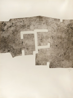
Chillida is another sculptor who also worked in drawing and printmaking. When I look at his work, I'm inspired to consider how I will produce the final work from my photographic practice. In the Euzkadi print, it is interesting to consider how he placed the image on the paper, how those decisions become part of the composition and define a larger space. In Gravitation, materials are layered, with cut outs to define space and spatial relationships as well as mark-making to distinguish different compositional elements. This work inspires me to question whether photographs must be a single layer (I'm not thinking of Photoshop here), what might be gained by combining different materials, using cutouts to reveal only parts of an image. There's also many things to take away from this work in thinking about making artist's books.

Sunday, November 20, 2011

IMPRINT: Opening from within


I was at the opening of the show IMPRINT at Lúz Gallery this afternoon. Here are some of the comments people shared with me:

I love the way the images relate to each other.”

The work has a really cohesive quality, a real strength.”

There’s a great flow to this show.”

You might be thinking from those comments that IMPRINT is a solo show. It consists of the work of eight photographers who are, in the words of the gallery owners “artists who have made a lasting impression on us during the last 12-months.” A group show with such flow and cohesiveness it gives the impression of being a solo show? Yes, thanks to the skill and talent of the curator, Diana Millar. I am very fortunate to be one of the artists included in this show.

Millar and her partner Quinton Gordon are consistently presenting work at Lúz Gallery with the intention of not only putting outstanding photography before viewers, but doing so in a way that transforms how people think about photography. As someone else said to me at the opening:

I always love coming to this gallery, (and I apologize if this seems like a backhanded compliment), because I know what I’m going to see is art, not just photography.”

In putting together a group show that has a sense of cohesiveness with high visual impact, a talented curator like Millar must bring together several elements. The first important one is image selection, looking over the work of the different artists and selecting the strongest images from each. At some point in this process, consideration has to be given to how the images from different artists might relate to each other, although subjects, process and visual approaches are going to differ. Eventually this leads to designing the show itself, planning how works will be hung in the gallery space to create a natural visual flow that creates that sense of cohesiveness.

In the case of IMPRINT, Diana successfully brought together the dreamscape images of Susan Burnstine, panoramic views of seashore and sky by Karen Curry and abstract light sketches by Gillian Lindsay in one physical zone of the gallery. From this description it might not seem that these images would relate to each other, but they share a lyrical quality and give the viewer a sense of passing from a internal view (dreamscape) to the external view (panoramic widescreen) to an almost subconscious view of the abstract light patterns. What I loved about this grouping of images was the way it invites inquiry – as a viewer you sense the flow and relationship between the works of these three artists before you can articulate why that flow exists.

The role of process in Gillian Lindsay’s work provides a nice bridge to the second zone created by Millar within the gallery space, where lumen prints from my series Taxonomy were hung along with the Surfland series of wet plate collodion tintypes by Joni Sternbach, the Polaroid images of Sea Life by David Ellingsen, the hand annotated landscape images of Lyndia Terre, the soft focus images of a fishing village by Jan Gates and the Mile Zero images by Quinton Gordon. Once again there is a nice flow and interplay between these diverse works, with an underlying link of documentation: of plants (Taxonomy), a closed culture (Surfland), biodiversity (Sea Life), mapping the landscape (Terre), of a disappearing culture (fishing village), and of the daily landscape (Mile Zero). Although the different processes used were quite diverse, from one to the next there was always at least one shared characteristic, which leads the viewer not only to connect process to process, but also to think about how each subject matter is best served by one process over others.

Usually openings are mainly social events held in the dark of night, where friends and family come to support the artist(s). They are characterized by being overcrowded, making viewing of the actual work difficult. Most of the time people stand in groups chatting, their backs to the art work. This afternoon’s opening was a welcome change from this norm. Held on a sunny afternoon, the work was shown to its best advantage under natural light. There was a steady flow of people, and while there was socializing for sure, I noticed that a lot of people looked carefully at the work, talked about it, considered it, and then went back two or three times to look again. The strength of the work drew them in the first time, but it was Diana’s excellent work as curator that created the flow and cohesiveness that brought them back to consider further the work again.

Check back with the Lúz Gallery website for photos of the installation and opening. I apologize for not including any here, but from the start of the opening to the finish, I was completely immersed in the experience and gave no thought to taking photos myself. It is a deeply engrossing show – if you are in Victoria or can find a way to get over before December 22nd, I hope you will come and see the work.

Saturday, November 12, 2011

Stepping into the Abyss


Last night I listened at Lúz Gallery to an artist talk by photographer Dan Milnor, that was very personal, very insightful and very thought provoking. It was as much about his journey as an artist as it was about the art that he’s made, a journey that has caused him to question everything he thought he knew about being a photographer.

Milnor had a successful career as a commercial and fine art photographer, when around fifteen years ago he became tired of the demands of commercial photography and took a job with Kodak. The job required him to sign a non-competition agreement, and in return as a Kodak employee Milnor had access to as much film and processing as he wanted to pursue his personal photographic projects outside of work. Released from client demands, his personal photography took off and he had the freedom to plan specific long-term projects that sometimes took years to complete. The talk began with a slide show of work from a project on the Easter pageants in remote villages in Sicily. Paired with haunting music, the images had power and strength. This project, and others he undertook in the same time period were very focused and planned, with the intention of generating images for exhibitions and potentially books. At the end of his fifth year of working for Kodak, Milnor had amassed several bodies of work that impressed other accomplished photographers. At this point Dan had an epiphany, equating the freedom he had from working for clients with the ability to focus on and produce excellent personal work. Having had that epiphany, Milnor left Kodak and once again became a commercial photographer.

Ten years later, Milnor sensed something missing. The first hint was a decision to visit a friend in Panama and to take some pictures, but to just take “snapshots” rather than doing a specific, focused and well planned project. He found the experience somewhat surreal, in the sense that he was more aware of all that was around him, and he made images of whatever attracted his attention. It went against the grain of how he’d worked before, and how he’d been trained to work and to think about making photographs. After the trip, Milnor edited his images and created a book using the print-on-demand service Blurb. Another part of the puzzle to his growing unease with his commercial photography career came one day while he was at home, watching planes take off from John Wayne Airport. He was thinking how he should be on one of those planes, going somewhere else to make photographs, when he realized that a decent photographer should be able to make good images wherever they are, including at home. Thus began the project “Homework”, defined only by restrictions on locale and how many exposures on film he would make at any given time. The resulting images are abstract, raw and very engaging and again he self-published them as a book for his own reference, considering the images as something of meaning only to himself. It was during a visit to a local art broker to deliver work from another series that he learned to his surprise that the Homework images were ones that the broker felt would be easy to place with clients.

So these two personal projects developed more organically, with virtually no planning compared to his previous personal projects. Dan had really not planned a specific outcome for the work, nor did he necessarily see it as having the wider artistic appeal of his more focused work like the images from the Sicily project. I think one might be able to describe these last two projects, and how they worked out, as a second epiphany of sorts as Milnor continued to consider the impact of being a commercial photographer. It was at this point that the offer of a full-time position as Photographer at Large with Blurb dovetailed with a decision to once again stop being a commercial photographer.

Dan turned his attention to his abiding interest in the “wild west”. He grew up on a ranch in Wyoming, and has been fascinated with the remaining vestiges of the past history of the frontier ethos that exists today in states like New Mexico. His current working project is “The New Mexico Project”, and it started out as a planned, focused project in two parts, the first being “Wildness”. After working on the project for awhile, Milnor was driving from LA to New Mexico, his mind filled with ideas and thoughts about how the project was developing, how to pull images together for an exhibition or book, when he realized that he had been passing through an interesting landscape that he was completely ignoring. He reflected on the fact that the Panama and Homework projects, lacking such specific focus, had allowed him to be much more aware of everything around him at any given moment. This realization lead to the third and final of his epiphanies, and it was the one that caused Milnor to turn his back on the concerns of the photographic establishment with respect to what defines a project and what are the desired outcomes of a project. It also completed a long, slow process by which Milnor unlearned the patterns of thinking that go along with those concerns.

This was the point where I felt that I was no longer listening to a great, articulate artist’s talk, I was listening to something unique and very special. Because Dan Milnor, after years of being a successful photographer by just about anyone’s standards, threw out everything he knew about being a successful photographer and asked himself the critical question “What does photography really mean to me personally?” It was at this key point that the lessons learned from the Panama and Homework projects came together to change the direction of the New Mexico project.

Milnor found himself in northern New Mexico where he slowly worked at being accepted in a small town that didn’t see many gringos. He began photographing the farmers and then other members of the town, some who have never been photographed, and have never held a photographic print in their hands. He wasn’t sure what the outcome of the project would be, but he realized that the people the project was arguably most important to would be the least likely to see the finished work – that is, those he was photographing. His sole concern about the outcome of this project is how he can engage the subjects of this project with the work itself. Dan would like them to be able to see and interact with the work, and to contribute their thoughts and impressions on what it being photographed means to them. This is a project outcome that lies well outside the understanding of the current photography world.

Dan described how he’d photographed a farmer who had never had his photograph taken before, who had never used a computer. The farmer’s wife showed him his photograph by lifting the lid of the laptop, where the first thing he ever saw on a computer was a photograph of himself. In this day and age of “Photography 2.0 on the Web” etc, it’s almost unimaginable. It’s not difficult to see a parallel between a subject seeing an image of himself for the very first time, and a photographer who has walked away from one understanding of what photography means to search for a different understanding.

I sense that Milnor’s desire to hear from his subjects about their experiences of being photographed and how having prints of their images has brought that experience into their lives, is tied into his own query about what photography, and being a photographer, means to him. It’s a shared journey between photographer and subject, a way to deepen further the engagement between the two. By approaching this project in a completely unstructured way, with no particular destination in mind, Milnor has taken the proverbial leap of faith, and stepped off into the abyss.

In one of those odd quirks of synchronicity, this morning I started reading a book that’s been on my nightstand for a while. It’s “A Field Guide to Getting Lost” by Rebecca Solnit. In the very first essay, Solnit writes “Leave the door open for the unknown, the door into the dark. That’s where the most important things come from, where you yourself came from, and where you will go.” She goes on to recount an experience she had while giving a workshop, when a student came to her with a quote from the pre-Socratic philosopher Meno “How will you go about finding that thing the nature of which is totally unknown to you?” Solnit goes on to write that “it is the job of artists to open doors and invite prophesies, the unknown, the unfamiliar; it’s where their work comes from…”

It’s not easy to leave the comfort zone, to stop turning the crank making work that is on the surface successful, but which has perhaps lost significance or meaning for the maker. Yet as Solnit writes, that is exactly what the job of the artist is, and it was a singular privilege to hear Dan Milnor talk so honestly about how that journey has transpired for him.