Showing posts with label darkroom print. Show all posts

Friday, July 1, 2011

Ambrotype Prints - Channeling Chuck Close

I had the opportunity yesterday to get into the darkroom to try printing the ambrotype negative I made last weekend. I have a 4X5 enlarger, but no carrier for glass negatives. I took apart a spare 4X5 negative carrier, and used cardboard to build a glass negative tray on the top half of the carrier. It was an incredible moment when I first saw the enlarged negative, with its continuous tones.

the modified glass negative carrier

in the enlarger

the projected negative
    (click on image to view larger)

I started by making a proof print on Ilford MGIV paper, at grade 2. The print had the rich tones of the tintypes I had made, but seemed a bit cool. So I made a print on Ilford warmtone paper:

fractured self (Ilford Warmtone Paper)
(click on image to view larger)

One of the things I was interested in trying with the negative was lith printing. I started with a lith print on Fomatone MG Classic paper, which was interesting but a bit too orange in tone. I think I might investigate this paper further by following up with selenium toning to see if I can tame the colour.

fractured self (lith print on Fomatone MG Classic Paper)
(click on image to view larger)

I had made a second print on the Ilford warmtone paper with double the correct exposure so that I could try a process called "second pass lith". The idea is to overexpose the print, process normally, then bleach the print partially followed by a second development with a lith developer. I chose to use copper sulphate bleach because it can cause a split-tone or pseudo-solarization with second pass lith. I like this image, it feels as if it references the experiments of Man Ray:
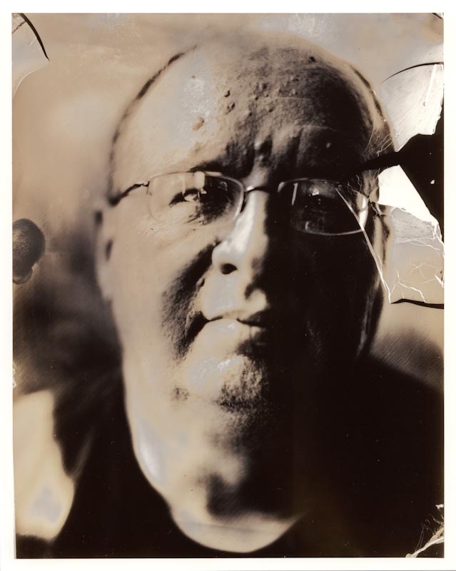
fractured self, rayified (second pass lith print on Ilford Warmtone)
(click on image to view larger)

Finally, I tried a straight lith print on Kentmere Fineprint warmtone paper. I've had hit and miss results with lith printing this paper, it seems very slow to develop and doesn't always give interesting results. However, this print is for me the most successful - it has the creamy tones of a cyanide-fixed tintype combined with shadow detail that has the feel of a charcoal drawing:

fractured self (lith print on Kentmere Fineprint warmtone)
(click on image to view larger)

In future, I have a couple of other paper choices to investigate with lith printing. I'm also looking forward to printing this negative as a salt print and a kallitype. I'm excited about getting everything together to make more ambrotype negatives in my studio so that I can keep pushing this process.

Saturday, June 11, 2011

Photographs are Objects


(click on an image to view larger)

I've been thinking recently about the gulf that seems to exist between viewing images online, on screen and what I consider to be the true test of an image's strength - as a physical object. I recently was reminded of how big that gulf can be when I first looked at the work of Lis Bailley's work New Horizons on the Luz Gallery website. The images when viewed on the web didn't seem to have much substance to me, so I was very pleasantly surprised at how powerful those same images were when I encountered them as prints on the gallery walls. They had a richness and pull that was completely absent when viewed on screen. 

A couple of years ago, I made a decision to stop scanning black and white film after I developed it, and return to traditional printing of the images. I was craving the opportunity to work in the darkroom, and to hold finished prints in my hands. Over time, I find I'm evolving an odd hybrid workflow for black and white - shoot film, process and print in darkroom, scan print and then post on blog/flickr etc. There's a certain rhythm that's developed in this workflow that really resonates with me. At the moment, I'm laying out a zine of Holga images I took on a trip to San Francisco back in October. All of the images were first printed in the darkroom, then scanned and now printed out with a laser printer. I'm in the process of culling and sequencing the images, and will produce a low-tech zine with the laser printer. It will be the first publication of my newest venture Studio Centralé Press, which marries my long-standing love of books with my conviction that my photographic work (and that of others) is best viewed as physical objects.

The website is currently under construction, but if you are interested in learning more, I am starting a blog for Studio Centralé which I will update with news of progress and publications.

Monday, March 14, 2011

Through the thin veil of the sky

Title: "Looking west towards the Golden Gate"
(click on image to view larger)
  

Saturday, February 26, 2011

Lurking II

Title: "A deepening stillness"
(click on image to view larger)
  
The shadows whisper, reluctant to reveal their secrets but burdened by the deepening mystery that surrounds them.

Thursday, February 24, 2011

In the cooling shade

Title: "Gleaming"
(click on image to view larger)
  
It is such a relief to stand in the cooling shade after a long, hot climb; to see the intensity of the sun condensed into one glowing point reflection.

Tuesday, February 22, 2011

Lurking

Title: "Shadowtalking, Coit Tower (Oct 2010)"
(click on image to view larger)
  
I love the distortion of shadows - the world seems familiar and strange at the same time. To me one of the interesting things about shadows is how often we inherently recognize what is casting the shadow, even in the absence of the actual object. I'm also captivated by the indirect stories they tell of our existence.

Sunday, February 20, 2011

A Unseemly Sense of Scale

Title: "Coit Tower, Mid Morning"
(click on image to view larger)
  
There is something about towering objects that invokes ambiguous feelings - on the one hand, there is a sense of majesty and wonder; on the other hand, the erection of a towering object seems overly egotistical. In this case, the tower (even with its marvelous views) is overshadowed by the incredible murals in the base building - so marvelous that one can excuse the excess of the tower.

Saturday, February 12, 2011

Beyond a Gnomic Existence

Title: "Class struggle, Filbert St. Stairs"
(click on image to view larger)
  
This statue was an unexpected find while climbing the Filbert Street stairs to the Coit Tower. It reminded me of statuary I saw many years ago in the former Eastern Bloc of Europe - a writhing mass of naked bodies in some way meant to epitomize the class struggle against oppression. Transported to a well tended English-style garden, it seemed to have acquired a faint whiff of eroticism.

Wednesday, February 9, 2011

An Uncertain Majesty

Title: "Palm Bifurcating Frame, Filbert St. Steps"
(click on image to view larger)
  
It's interesting to work with these negatives several months after the images were made. In looking them over, I found what was for me a rather high proportion of images with the subject firmly centered in the frame. I usually consider placement carefully when composing an image, and I have no reason to think I wasn't working carefully at the time. I have always had a strong affinity for the square format - back when I was painting in watercolour and acrylics, the vast majority of my work was on square fields. Many painters dislike the square format, but my feeling was always that once I made the first mark on the paper or canvas, the square had inextricably been divided into rectangular spaces. I think with these images from SF, I was simply finding that middle placement of a subject works well with a square frame.

Tuesday, February 8, 2011

A Journey Measured in Inches

Title: "In the shadow of the Golden Gate"
(click on image to view larger)
  
This was a hard-won view. Our friend Stephanie offered to drive us over the Golden Gate bridge after we'd all visited the De Young museum. Unexpectedly, what should have taken 15 minutes by car ended taking us over 2 hours - we hit the mother of all traffic jams, on a Sunday afternoon no less. Stephanie was baffled by what could possibly cause such a congestion, and we constantly dithered between hanging in there, or trying to find an escape route. Well, we hung in there and were rewarded by this late afternoon view of the long shadow the bridge casts over the water.

Thursday, February 3, 2011

Geometric Oddities

 Title: "Triangular View, DeYoung Museum"
(click on image to view larger)
  
I was entranced by the architecture of the DeYoung museum in Golden Gate Park. I was drawn to make this image by the intersection of the edges of the building and the shadow, and the way the rectangular window is divided into light and dark. I find myself vacillating between thoughts of impending doom (as if trapped in a deep dungeon) and eternal hope when I look at this image.

Wednesday, February 2, 2011

Iconic Cliché

Title: "Palm Tree, DeYoung Museum"
(click on image to view larger)
  
What, a holga image of a palm tree? Such a cliché you might say, but it's my cliché and I'm glad to have it. After all, it seems silly not to make an image of a palm tree when in California with your holga. I think it's the unpredictability of the plastic camera and film development that can make even such a cliché image unique. I have certain modifications I use to soften the image captured on film by my holgas, and in this case part of the modification has clearly scratched the film along the top edge. Also for some reason, I have a lot of "bromide drag" in the negative from the development process. I absolutely love these imperfections, the slightly quirky character they bring to the image that seems so appropriate for the subject, which seems to be listing precipitously towards the building behind.

Sunday, January 30, 2011

Old School Snapshot

Title: "Sisters, Golden Gate Park 2010"
(click on image to view larger)
  
Besides the fact that I love the subjects of this photo dearly, I love how this image connects to the long tradition of the family vacation snapshot - subjects posed in front of a water feature, image taken with grainy film, and printed in the darkroom with slightly high contrast. There are photo albums all over North America filled with images like this, and without the date in the title I think it would be easy to think this image was made in to early 1970s.

I was happy to get a bit of time in the darkroom this weekend. I shot 6 rolls of film with my Holga on this short trip to SF, and I've just made prints from two of the rolls. I want to get the rest of the frames printed, and then make a selection of them to use in a zine or chapbook. I'm looking forward to converting these into a precious, low-tech object.

Wednesday, January 19, 2011

Alien Contingent

Title: "Nob Hill Voodoo"
(click on image to view larger)
  
One morning I went out early for a walk around the neighbourhood of our hotel. As I climbed up a hill, I came across this display in a shop window. There were stately buildings all around, and some very expensive hotels a block away. Not to mention the Masonic Temple! It all seemed a bit spooky....

Tuesday, January 18, 2011

Big Alma

Title: "Victory, Union Square"
(click on image to view larger)
  
"Big Alma", Alma de Bretteville (also known as "The Great Grandmother of San Francisco") met her future husband thanks to modeling for this monument to commemorate George Dewey's victory in the Battle of Manila Bay during the Spanish American war. This statue was selected from a number of entries and only barely made the cut, thanks to the crucial vote of the chair of the Citizen's Committee, Adolph Spreckels. Although he was twice her age, she was smitten by him and eventually after a five-year courtship, they married on May 11, 1908. Because he was head of the Spreckels Sugar Company, Alma often referred to her husband as her "sugar daddy"

Monday, January 17, 2011

It is good to know the truth, but it is better to speak of palm trees

Title: "Two palms facing outward"
(click on image to view larger)
  
The title of this post is apparently an Arabic proverb. I think a good proverb, like good art, is somewhat enigmatic or ambiguous, allowing for personal interpretation.

Sunday, January 16, 2011

Little Blue Box

Title: "Tiffany & Co."
(click on image to view larger)
  
One of the casual images I made during our short trip to San Francisco in the fall. I had never used the holga for "travel" photography, in fact I've rarely used the holga for urban photography and felt a bit out of my element. Unsure of what I'd get, unsure of what to look for in terms of subject. There was a lot of hit and miss....

Sunday, January 9, 2011

Why Read?

Title: "View Alcatraz", San Francisco, October 2010
(click on image to view larger)
  
I've recently begun reading Harold Bloom's book "How to Read and Why", and he writes a number of things in the prologue that I think apply equally well to making art as they do to reading. Bloom writes:
"It matters, if individuals are to retain any capacity to form their own judgments and opinions, that they continue to read for themselves...why they read must be for and in their own interest...one of the uses of reading is to prepare ourselves for change..." Bloom goes on to fuse the wisdom of Bacon, Johnson and Emerson to say "find what comes near to you...that addresses you...then weigh and consider the nature it shares with you; its closeness to yourself." 
  
It's not difficult to see that these are wise words to be considered by artists, or anyone interested in art. In order to educate ourselves to be able to form judgments and opinions, we need to be making art or carefully looking at and thinking about art. Being immersed in art as an artist or a viewer is an important part of the process of change, of expanding our understanding of the world and ourselves. Making art that speaks to us (or viewing art that speaks to us), and carefully considering how and why it makes that connection to us, is a way to deeper self-understanding. I think that in my own case, it is these common threads between reading and making art that bring me to constantly consider what story an artwork conveys to me - I often get a sense of narrative when looking at work I've made, even though it's been made without a specific narrative in mind.
  
Bloom goes on in the prologue to numerate five principles he feels are important to restore the way we should read. Again, I can readily see how these apply to making art:
 
1. Clear your mind of cant 
(Cant referring to pious platitudes, the peculiar vocabulary of a sect or coven. One of the reasons I have reduced my interaction with internet sites like Flickr was to do exactly this, because I found myself being influenced too much by thinking of how work I posted would be "received")
 
2. Do not attempt to improve your neighbor by what or how you read
(In essence, rather than evangelize, spend the time making art. Here I see the analogy as being one of spend precious time making work rather than spend countless hours looking at other's work on the net, commenting on the work of others, evangelizing a specific point of view of how to make work)
 
3. A scholar is a candle which the love and desire of all men will light
(Bloom says that one's development as a reader is not selfish because it acts as an inspiration to others. The same can be said of the time taken for making art - good art inspires others to make art)
 
4. One must be an inventor to read well
(Bloom says "we read, frequently if unknowingly, in quest of a mind more original than our own". I take this principle to mean that we make art, often unknowingly, because we are constantly trying to realize the potential we each have to invent a new view of the world that surrounds us)
 
5. Recovery of the ironic
(Bloom mourns the loss of irony, because he sees it as the death of reading, and of that which has been civilized in our natures. In making art, there is plenty of scope to be ironic, or to accept the ironies that the process of art making constantly throws at us. Bloom goes on to state "Irony demands a certain attention span, and the ability to sustain antithetical ideas, even when they collide with one another". Just exactly what it takes to make art (attention span) that holds true meaning (antithetical ideas), with great excitement and satisfaction in the process (the collision of ideas))